A little snippet for nicer plots using matplotlib
If you’ve seen previous blog posts (or read any of our group papers) you may have noticed the plots have a consistent look.
import seaborn as sns
from matplotlib import pyplot as plt
The default matplotlib look
plt.plot([1,2,5,3])[<matplotlib.lines.Line2D at 0x11530e960>]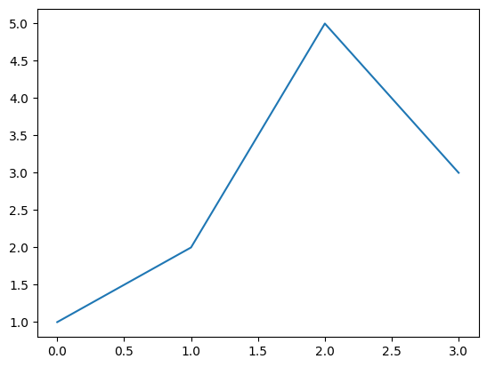
Not bad but try the following now
from matplotlib_inline.backend_inline import set_matplotlib_formats
set_matplotlib_formats('svg')

sns.set_theme('talk', 'ticks', font='Arial', font_scale=1.0, rc={'svg.fonttype': 'none'})plt.plot([1,2,5,3])[<matplotlib.lines.Line2D at 0x1154e8ce0>]
An added perk is that the plot is now embedded in your notebook as SVG so if you export to Markdown/HTML they will stay nice and crisp.